
Intro
Role: Product Designer (product thinking, visual design & interaction design)
Team: Privacy & Identity at Uber
Tools used: Figma, Principle, pen & paper
Design brief
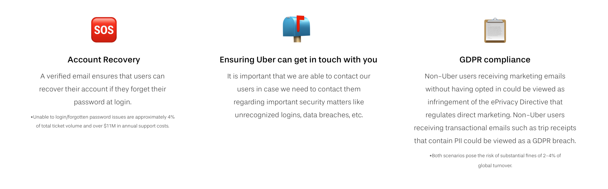
Only ~20% of active riders had a verified email on their account. The low percentage of active Uber riders with a verified email posed a number of problems.
How might we nudge riders on the Uber platform to verify their email addresses?
Problems
While users can still use Uber without verifying their email, an unverified email address poses a number of problems. And, despite these problems, Uber does not require email verification during sign up due to concerns around growth.
Competitive Analysis
Many social media companies take a softer, more passive approach, whereas cash and payment companies are more strict/blocking regarding email verification.

Regarding the actual verification process, there’s two methods of verifying emails:
A one time password (OTP) that gets sent to the user’s email and the user has to return to the app to enter in the password.
A one tap verification button embedded in the email that deep links the user to a “verified” confirmation page.
Although the OTP approach requires an extra step of returning to the app, the engineers were firm that they did not want to change that approach as it is a) more secure in validating one’s identity and b) the code was already written/implemented from the past.
Current verification flow
The current flow to verify an email address is more tailored to a user trying to update their email rather than verify their current address. Despite that, it’s concerning that four taps through settings/account there’s no indication the email address is not verified.


Ideation
Uber’s philosophy is to not block unverified users (due to concerns around growth), so I explored a variety of different potential passive approaches to heavier nudges:
Increasing visibility in account settings
Nudging the user to verify their email while they’re on a trip
Creating an entry point within email receipts
Leveraging Uber’s homepage messaging framework

Available surfaces
I ran into some roadblocks with the more “aggressive” approaches:
Uber’s messaging framework is primarily reserved for promos and high priority messages (ex: your credit card expired).
The CTA within the email was a potential privacy issue in the instance an email was forwarded and opened by another user.
The on trip feed is reserved for only details about the trip, Safety features, and Uber related promotions. Despite the importance of a verified email, stakeholders on the Rider team were not willing to budge on this surface.


